twelve days of romance
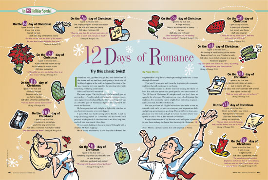
While designing layouts, sometimes it’s a good idea to illustrate it yourself as well. The idea was to mimic that retro-sixties look. Initially, the editor wanted the images to be photographic, but I couldn’t see putting a snapshot of a pair of women’s flying red panties in a Christian magazine (top, right). The illustration makes the whole spread fun. Once she saw the finished product, the editor was very happy with the result.
