the razor's edge
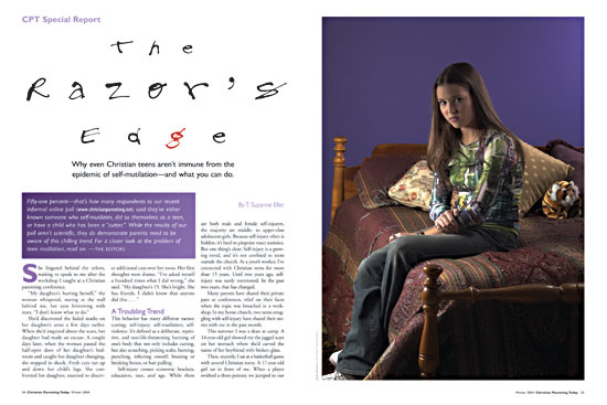
After a couple of years with CPT‘s “oasis of calm” design philosophy, a new editor arrived and produced an article about teen cutting. While it was important information for parents to know, I had to convey both the darkness of the subject matter, and still have the layout match sunlit tone of the the rest of the magazine. Familiar elements like recurring type treatments and wide white margins kept the sudden seriousness from being to jarring.
The plush tiger came from a previous product review. I liked the idea that a tiger had both claws and stripes on its body, and would be something a girl involved with cutting would have on her bed. Deep symbolism, I know. Wooooo.
Bob Conway shot the photography for the article.
